
Year 2015
Tools and methods: Usability Test
Company: EF central design team
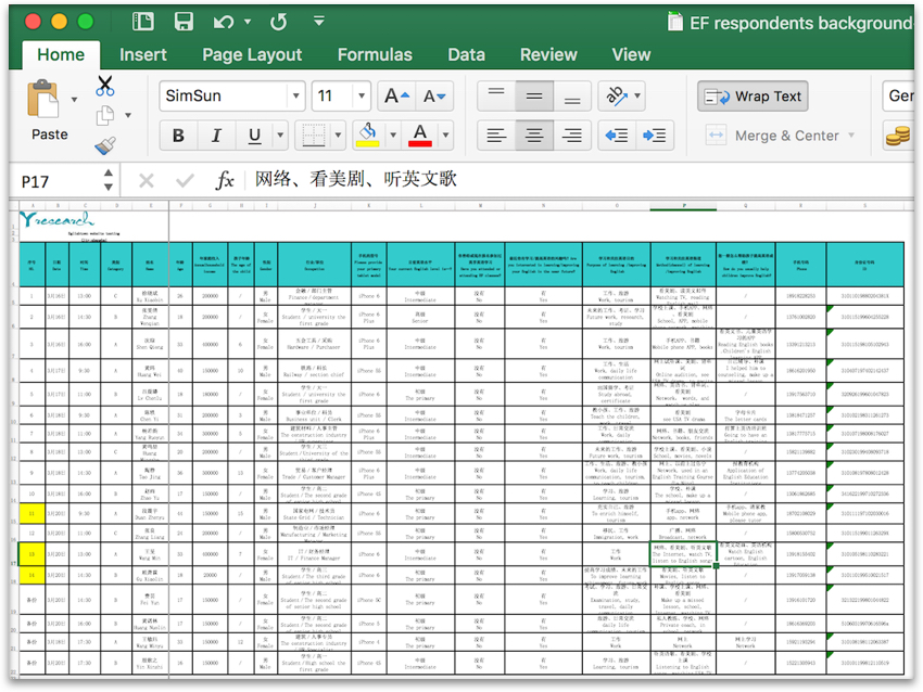
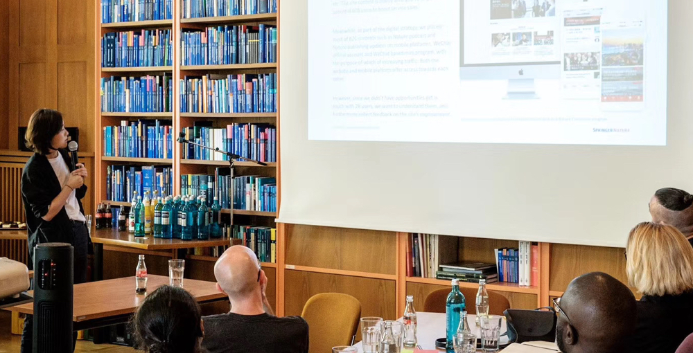
Field Location: Shanghai, Hong Kong, Seoul
Team: Thomas Le Corre, May Kwong, Kit Hoang, Mark Parnell
Background
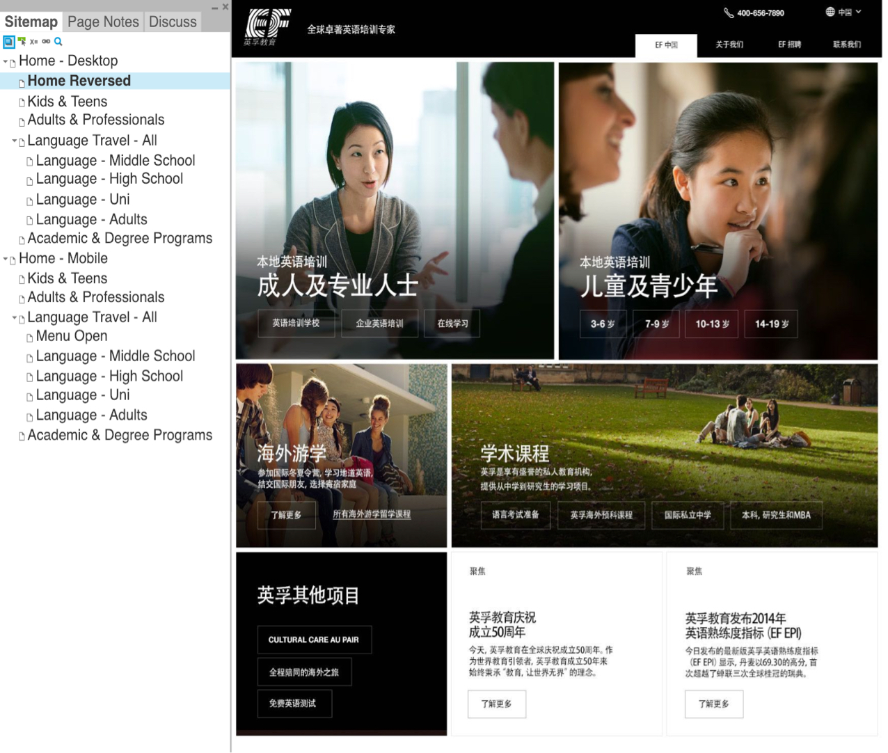
The EF central creative team have recently worked on a modern, responsive redesign of the ef.com homepage, both mobile version and desktop version. The landing pages has two functions, first to of course to build the first impression of EF as a brand for both potential consumers and current EF-ers. Secondly, the page functions as a selling page which routes users to the most relevant EF property for them, during which to retain consumers’ acquisition. Based on the two design objectives, we organized tests in three cities in Asia to balance a more euro-centric aesthetic interpretation of the website design.
Research Process
The design team has made two different protocols with two slightly different directions of design. Respondents are recruited based on target market personas. Each respondents are required to conduct a series of tasks on both of the two versions. Tasks are given to test the speed and accuracy with which users are redirected to the best product. And competency and time used are two main measurements indexing the success of tasks accomplished. At the wrap up interview, we understand how pictures and copy texts play an part in building up users’ perception in each market.
